0 to 80 in 30 minutes
Everyone's posting their "I built this in 30 minutes" demos. Nobody's posting the 30 hours that came after.
Read more ›
There is a category error happening in the current conversation about AI and design.
Everyone has correctly noticed that AI-generated websites tend to look the same.
Purple gradients. Giant centred headlines. Three identical feature cards. Floating dashboard screenshots. Glowing orbs. Rounded rectangles inside more rounded rectangles. A vaguely futuristic illustration that has almost nothing to do with the product.
So a new class of tools has emerged promising to give AI “taste”.
They ban the purple gradients. They introduce serif typography. They vary the grid. They add more whitespace. They replace the three feature cards with a bento layout. They sprinkle in scroll animation and put an art-directed image behind the hero.
The result is usually better.
But it is not taste.
It is slop in a better suit.
Taste Skill is a useful example.
Its framework tells an AI agent to study the brief, avoid known AI patterns, choose more varied layouts, and control visual density and motion. It contains sensible rules about typography, spacing, accessibility, and composition. It even explicitly bans some of the clichés that make generated websites instantly recognisable as generated websites.
That is valuable.
But it is better described as a design linter.
It catches obvious tells. It prevents some poor decisions. It gives the model a larger catalogue of accepted patterns to choose from.
What it cannot do is answer the most important question:
Why should this particular product look and behave this particular way?
An asymmetric hero is not a creative direction.
A serif font is not a creative direction.
A sticky-stack animation is not a creative direction.
A tasteful colour palette is not a creative direction.
They are ingredients.
Taste is deciding which ingredients belong together, which ones must be rejected, and what larger idea they are all serving.
A lot of supposedly tasteful AI design is simply the same underlying website architecture with a more expensive skin.
The generic SaaS layout remains intact:
Navigation. Hero. Social proof. Feature cards. Big generated image. Testimonials. Pricing. CTA.
The purple gradient becomes an editorial photograph.
The glowing orb becomes a beautifully rendered 3D object.
The generic dashboard mock-up becomes a generated brand image.
But the thinking underneath it has not changed.
The image is doing all the work while the page beneath it remains structurally anonymous.
It looks designed at first glance. But it could still belong to almost anything.
That is the test people are missing:
Could I replace the logo, copy, and screenshots and use this design for an entirely different company?
When the answer is yes, the work may have style, but it does not yet have authorship.
And interchangeable design is still slop, even when it is beautifully typeset.
Taste is not a collection of visual preferences.
Taste is the ability to recognise the right organising idea and make hundreds of decisions serve it.
It is deciding:
The individual choices might be small. A line. A rhythm. A transition. A type treatment. A particular kind of spacing.
But they all originate from the same thought.
Taste is not simply aesthetic preference. It is judgment applied in context.
Tankly is an aquarium app I built for iOS and web. Fishkeeping is a data problem dressed up as a hobby, and Tankly exists to make an invisible ecosystem legible before it fails.
These three screens tell the whole story of this article.
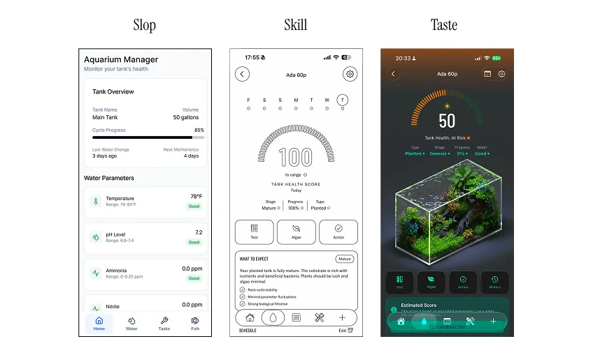
The first screen is raw AI output. It is not technically broken. It has cards, parameters, hierarchy, a tab bar. It looks like software. That is the problem. It could be any monitoring app for anything.
The second screen is what a skill gets you. Cleaner typography. A considered layout. A proper focal point. Clarity. This is genuinely useful, and it is exactly what a design linter should do: refine, clean up, remove the tells.
But it is still assembled from ingredients. Nothing on that screen belongs uniquely to this product.
The third screen is where taste enters, and it did not come from a prompt.
The idea was that the tank itself should be the interface. Not a photo of a tank. Not an icon of a fish. The actual living object at the centre of the product, rendered with real dimension.
So I spent hours building custom tanks and custom illustrations. Hundreds of them. And when I placed them into the screen, I animated the water surface, so the object does not just sit there. It behaves like water.
That is what gives the app a visual dimension no other aquarium app has.
AI supplied the foundation. The skill supplied the refinement and the clarity.
But the idea, and the execution of the idea, is where the taste lives.
AI, on its own, would never have arrived there.
The design engineer of the AI era is not simply the person who takes an AI-generated interface and makes it prettier.
They are the person who defines the world the AI is allowed to create inside.
They turn product strategy into visual grammar.
They decide that a product should behave like an instrument, an archive, a workshop, a field guide, a control room, or something that has never existed before.
Then they make that direction executable through:
The old model separated the person who imagined the interface from the person who built it.
AI is collapsing that boundary.
The most valuable design engineers will be able to form the idea, prototype it, encode it, and then direct multiple agents to expand it without diluting it.
They will not design every screen.
They will design the language from which the screens are generated.
This does not mean AI has no role in creative direction.
AI is extremely useful for exploration. It can produce variations, find references, test compositions, build animation prototypes, and rapidly express an established visual system.
But generation is not judgment.
AI can generate options.
It can increasingly recognise patterns.
It can learn what you usually approve or reject.
But it still needs somebody to determine whether the work is relevant, ownable, culturally aware, and worthy of existing.
That is taste.
A universal “taste prompt” is probably the wrong goal.
A generic model cannot possess everyone’s taste simultaneously. The more universally acceptable its output becomes, the more likely it is to converge on another polished average.
The real opportunity is to build a system that allows a human to:
The system should not merely remove bad defaults.
It should generate and preserve core tasteful elements.
Those elements are not fonts, gradients, cards, or fashionable layouts. They are the decisions that give a design authorship.
Before the system generates a page, it must understand the product.
It should extract:
For Tankly, this might produce:
A living ecosystem made legible before it fails.
That sentence is more useful than:
Calm, glassy, premium hobby app.
The first contains an idea.
The second contains styling instructions.
Every project should have a small set of foundational decisions that all later design work must inherit.
This is the taste kernel.
It should contain:
The core idea the design must express.
What the product believes about its category and the world around it.
The object, system, or behaviour that gives the visual world its logic.
What the experience should make the user feel: in control, curious, reassured, powerful, precise, playful, or something else.
The deliberate contrast that keeps the design from becoming bland.
Examples:
One interaction or motion principle that belongs to the product.
What the product must never become.
The taste kernel is the part that cannot be replaced by a list of accepted UI patterns.
It gives every later choice a reason to exist.
The agent should propose three to five mutually exclusive worlds, not five variations of the same hero section.
For Tankly, those territories might be:
The tank itself is the interface: a dimensional object at the centre of every screen, with the data orbiting it.
Chemistry as precision instrumentation. Readings, ranges, gauges, and calibrated intervals.
A naturalist’s record. Observations, sketches, and entries accumulating over time.
The whole app behaves like an aquarium: glassy surfaces, depth, light passing through layers.
Each territory must define its own:
No code should be generated until one territory is selected.
This is where human judgment remains essential.
The system can expand the possibility space. The human chooses which world is worth building.
Current AI design works backwards.
It selects a familiar page skeleton and decorates it afterwards.
A better system should first create the project’s visual vocabulary:
These are the core tasteful elements.
They should be derived from the taste kernel rather than selected from a generic component library.
Only after the primitives are approved should the system assemble pages.
The page is an expression of the language.
It is not the language itself.
The system should require provenance for every distinctive design decision.
For each motif, animation, image treatment, or unusual layout, the agent should be able to answer:
If an element exists only because it “looks premium”, it is a candidate for removal.
This does not mean every detail has to be literal.
Tasteful work can be abstract, emotional, and expressive.
But it should not be arbitrary.
A practical implementation could look like this:
/design-direction
  PRODUCT_TRUTH.md
  TASTE_KERNEL.md
  CATEGORY_CLICHES.md
  CREATIVE_TERRITORIES.md
  CREATIVE_DIRECTION.md
  VISUAL_GRAMMAR.md
  MOTION_GRAMMAR.md
  CONTENT_GRAMMAR.md
  ANTI_REFERENCES.md
  DESIGN_EVALS.yaml

  /references
  /anti-references
  /approved-screenshots
  /primitives
  /motion-tests
This becomes a project-specific constitution.
Every coding agent, design agent, and image-generation agent reads it before producing work.
The purpose is not to prescribe every pixel.
It is to stop agents from reverting to the average whenever they encounter an ambiguous decision.
The system should have distinct phases.
Understand the product, category, audience, and strategic tension.
Generate genuinely different creative directions.
A human chooses, combines, or rejects the territories.
Turn the selected direction into primitives, rules, and signature behaviours.
Generate pages, components, imagery, and motion inside that grammar.
Render the result and test whether it still expresses the original idea.
Most AI workflows collapse all six phases into a single instruction:
Build me a beautiful website for X.
That almost guarantees a polished average.
The system must render the actual result and critique what it sees.
A codebase can comply perfectly with a design file and still produce something generic.
Useful evaluations include:
Could the same design sell an unrelated product after changing its logo and copy?
Can every distinctive motif be traced back to the product, brand, audience, or strategy?
Is the creativity confined to one generated image sitting inside an otherwise generic page?
If all images and colours are removed, is the underlying composition still distinctive?
Is the system coherent, or has every section repeated the same cards, borders, and radii?
Is there at least one compositional, visual, or interactive idea a user might remember later?
Can the whole design be explained with one organising thought rather than a list of style adjectives?
Has the current output moved away from the approved territory and back towards common AI defaults?
These should be treated like design tests.
A build that fails them should not ship, even if the code is clean.
A taste system should recognise when an agent has fallen back on familiar shortcuts.
Examples:
The system should not merely ban these patterns globally.
Sometimes a centred hero or a three-column grid is exactly right.
The question is whether the choice follows from the direction or from model habit.
A real system would learn from:
The important asset is not the image library alone.
It is the reasoning attached to it.
A reference without an explanation encourages imitation.
A reference with an explanation teaches judgment.
For example:
Use this reference for its contrast between rigid structure and playful motion. Do not copy its colour palette, typography, or page layout.
Over time, the system builds a model of the designer’s decisions rather than merely a mood board of their favourite visuals.
One agent should create.
Another should attack the result.
The critique agent should be instructed to find:
A third agent can then revise the work, but it should not be allowed to solve every problem by adding more decoration.
Sometimes the correct revision is subtraction.
Sometimes it is structural.
Sometimes it requires returning to the creative territory rather than tweaking the component.
The purpose of the system is not to remove the designer.
It is to move the designer away from repetitive production and towards the decisions that define the work.
The human should own:
The AI can own:
That is a far more realistic model than asking AI to become tasteful in the abstract.
The defensible proposition is not:
Give your AI good taste.
It is:
Turn your creative direction into an executable system every AI agent has to obey.
An anti-slop framework can be useful within that system.
It can raise the floor.
But it cannot create the ceiling.
The larger system has to enforce a sequence of:
truth → tension → territories → human selection → taste kernel → primitives → implementation → visual audit
That is how we move from styling to authorship.
The human still supplies the judgment.
The machine makes that judgment durable, scalable, and much harder to accidentally sand back into the average.
AI produces the pages. The design engineer authors the language.
Everyone's posting their "I built this in 30 minutes" demos. Nobody's posting the 30 hours that came after.
Read more ›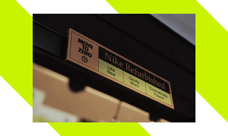
Nike are going full circle. Kinda. Nike launches the "refurbished sneaker program" aiming to give used sneakers a chance at a second life.
Read more ›
In the early days of content production, teams spent endless time and money on a single piece of content. Here's how to stop a thumb in its tracks.
Read more ›Notes on building and designing products in the agentic age, where taste is the edge. Join 20,000 people getting them, direct to your inbox.